There are standards of one sort or another in most industries. Web design has standards too. That doesn’t meant that you should follow them or every website should look the same, but it’s nice to know them and compare your website to industry’s standards (as of 2016).
Recently came across a document published by the Design Council UK. It’s aimed at you, a business owner, startup or employee. It talks about how you should approach design and gives you a whole bunch of tips on how to pick the right designer or design company.
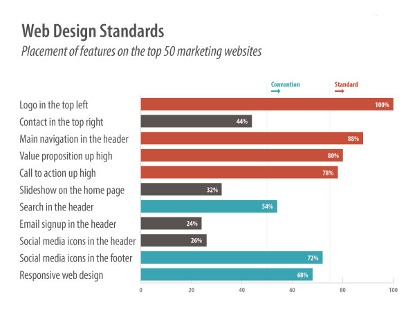
Have a read of this from Orbit Media Studios in Chicago and see for yourself. Below are just a few points they mention.
3. Main navigation across the top
88% of the websites had the main navigation located in the header at the top of every page, making horizontal top-level navigation a web design standard.
4. Home page slideshow
32% of the websites have a home page slideshow (also known as a carousel) with a rotating series of images and messages.
6. Call to Action high up on the home page
78% of the websites had visually prominent calls to action. The percentage fell below our threshold for standard, it’s certainly a convention.